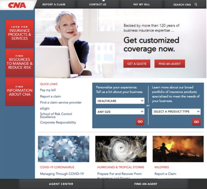
A Big but “Simple” Refresh
During my time as a Product Owner at CNA Insurance, I helped introduce a website re-design with a new, simplified navigation to reflect CNA’s evolution of market strategy and Business Units over the last few years. This Epic included several features supporting user experience, search engine optimization, web accessibility, content marketing and web analytics.
It also removed over 500 underperforming or redundant web pages, making the user experience simpler, reducing the cost of ownership and strengthening our ability to deliver consistent brand messaging.
The true magnitude of this change becomes apparent when you look at the numbers:
2 years of strategic planning
10 months of design and content creation
29 newly designed and written industry, product and solution pages
55 priority SEO optimized keywords
80 new images to represent the brand
500+ archived webpages
500+ redirected URLs
Outcomes:
This effort improved the user experience by decreasing site searches by 44% and increased pages per visit by over 10%
Achieved full compliance with Level AA Web Content Accessibility Guidelines (WCAG) 2.1
Increased brand visibility by improving overall site SEO score by 13%
Aligned our site to top quartile, with site performance 15% higher compared to our competitors
Collaborated with: Marketing, CNA's agency partner LoSasso, Technology BRMI, Application Development teams and stakeholders of various levels across the business
Responsible for: Supporting Product Manager with UX strategy, mock-up/wireframe creation, user story creation, content strategy, content publishing and quality assurance.
Old Homepage & Navigation
New Design, Simplified Navigation & Clear CTAs


